05. September 2024
(D)OOH: Creation & Design
- Public Video
- DOOH
- Digital DOOH
In our daily lives, we encounter outdoor advertising in different ways and in different forms: Whether large, imposing, digital or analog. But how do you manage to attract the full attention of the target group with an average viewing time of two seconds and convey a message that will be remembered? This involves special rules and design tips.
We start this multi-part blog series with a short intro by our author Georg Schotten, who tells you about the importance of creation in advertising communication in the context of public space.
Creation in public space: markets and cities
A clever person once described communication in urban environments with the phrase: “How does a city narrates itself?”
If we now understand the word “narrates” as something that is not to be taken literally, we are already well on our way. We are talking here about visual and more “one to many” communication. This brings us right into the middle of the topic of how image communication in public spaces must be designed and, above all, what distinguishes it from other environments of image communication.
First of all, we need to realize that cities/urban environments have historically been and still are places of intensive communication.
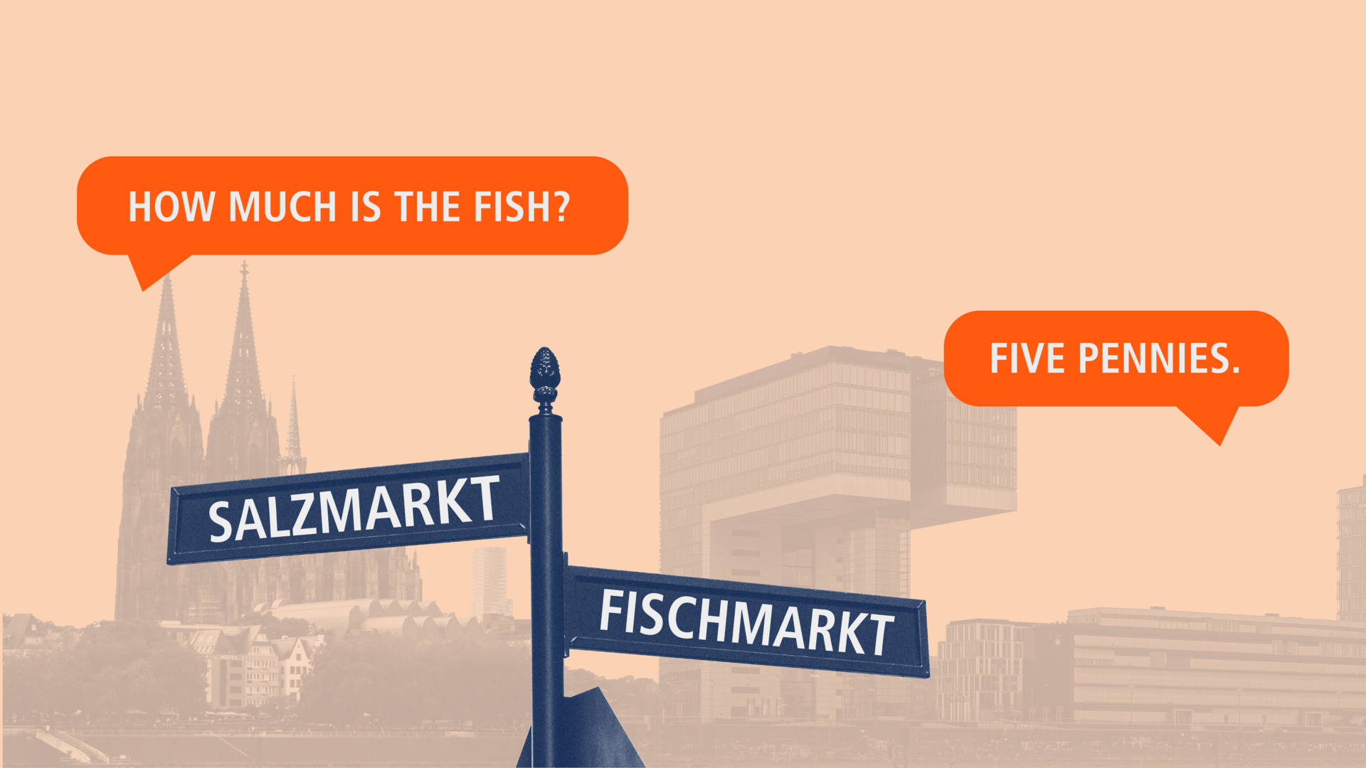
If we walk through Cologne's old town and look at the street names, we find the Neumarkt, Alter Markt, Fischmarkt, Pferdemarkt, Salzmarkt, Heumarkt and probably others. At all times, markets have not only stood for the trade of goods, but also for the exchange of information, i.e. for communication.
Cities also always stood for communication through dominant buildings that expressed the self-image of the builders. The Overstolzenhaus, a six-storey patrician house from the 13th century, can still be seen in Cologne's city center today and was intended to clearly display the family's wealth to everyone.
The large Romanesque churches, the historic town hall and Cologne Cathedral also stand for clear communication through buildings. Cologne Cathedral, for example, which for a long time was a symbol of the New Jerusalem and was built to replace the Jerusalem that was lost to the Christians, has an eventful history with different meanings as a building. After the foundation of the German Reich in 1871, the cathedral towers were completed with Reich funds in order to establish the then “German cathedral” as a symbol of strength and a sign of Germany's claim to the left bank of the Rhine vis-à-vis France.
We realize that large images have always been used as a clear message and since this has been used for so long, we can assume that there is a purpose to it.
So what makes image communication in public spaces so different from other forms of communication? And why should we be aware of certain connections?
First of all, we should note that images in public are embedded in the everyday lives of city dwellers and visitors, which makes them unavoidable, but they can also take on meaning.
Anyone who has been wondering what all this has to do with (D)OOH media should now pay attention.
The same rules that apply to visual messages emanating from other objects also apply to image communication in the field of (D)OOH media in public spaces.

Which design rules apply to Out-of-Home?
First of all, (D)OOH media are also embedded in the everyday lives of people in the urban environment, just as the objects mentioned above are, even if (D)OOH media are generally less spectacular. Although, if you think of Times Square in NY, you could see it differently.
It is also true for (D)OOH media that contact is unavoidable and most people do not want to avoid it. Unlike other forms of media communication, (D)OOH media do not interrupt any targeted activity. No bus leaves later because you have to look at the posters, no advertising space is on the carriageway and the subway does not have to wait until the advertising has finished running.
On the other hand, advertising on (D)OOH media has to assert itself against the sometimes complex environment. Here, too, Times Square can be seen as an extreme example. It is probably really difficult to remember a specific screen or a single message later on.
As this is the case, the need to follow the rules of image communication must be understood even more strictly here than in other media environments.

This includes the rule of being PLAKATIVE in poster advertising and the experience of wanting to stand out with striking contrasts and background colors. Some creations unfortunately die in fashionable tone-on-tone beauty. This can look stunning and elegant on a piece of cardboard in a meeting room, but in a big city environment it tends to get lost and fail to make an impact.
Above all, however, we strongly recommend being clear in the message and in the sender identification in image communication in public spaces.
Ogilvy is credited with saying that you should make the logo so big on posters that it hurts – and then double it. That makes some creatives' hearts cry out, but that's life.

Why you should include (D)OOH in your next campaign
So now, at the very least, the question arises as to why you should choose a communication channel where you have to pay attention to so many things and wonder if there is an easier way.
After all, as the Irish proverb says: “To every complex problem there is a simple answer – and it is wrong”. As always in life, however, you will be rewarded if you force yourself not to always take the easy way out.
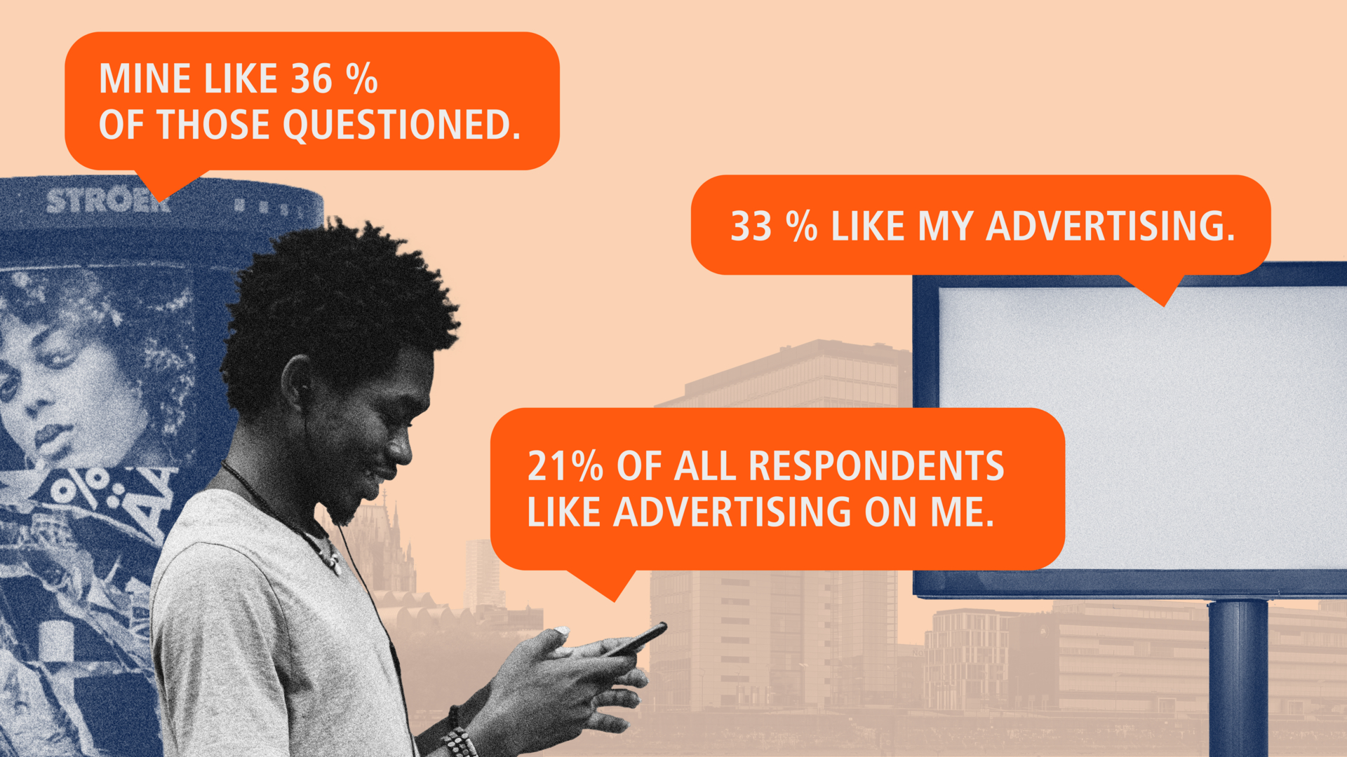
On the one hand, with a communication channel that Nobel Prize winner Daniel Kahneman has described as an “implicit medium” and which is effective even without direct attention. On the other hand, with a media channel that offers the opportunity to build up a broader reach in attractive target groups, even in times of the digital communication revolution, in which recipients can largely decide for themselves what media content they receive.

And this in a way that enjoys the highest acceptance of all channels and allows advertisers to confidently and openly present their message or product to the public, as Martin Luther once did: “Here I stand. I can do no other.” In times of consumer democracy and the search for “purpose”, this is perhaps an underestimated advantage.
If you then consider that outdoor advertising also enjoys greater credibility than other channels due to its origins in the advertising pillar, which was originally created for public announcements, then this medium can also be described as “history-proven”.
Who doesn't remember the example of historical (D)OOH communication from the movie “The Life of Brian” – “Romani ite Domum”. Remember: Less than six words!
And already inspired for the next D(OOH) campaign? Over the next few months, we will be presenting the most important elements of (D)OOH creation in our multi-part blog series, showing you various ways of interacting and inspiring you with innovative and technology-linked examples of success. Stay tuned!
Media content in this blog post was created with the help of AI.


