19. September 2024
Design principles for posters: How to create a striking advertisement
In our daily lives, we encounter outdoor advertising in different ways and in different forms: Whether large, imposing, digital or analog. But how do you manage to attract the full attention of the target group with an average viewing time of two seconds and convey a message that will be remembered? This entails special rules and design tips.
Following our lead article, in which we took a general look at the importance of creation in the advertising context of the public space, our author Thomas Brindöpke is now focusing on posters.
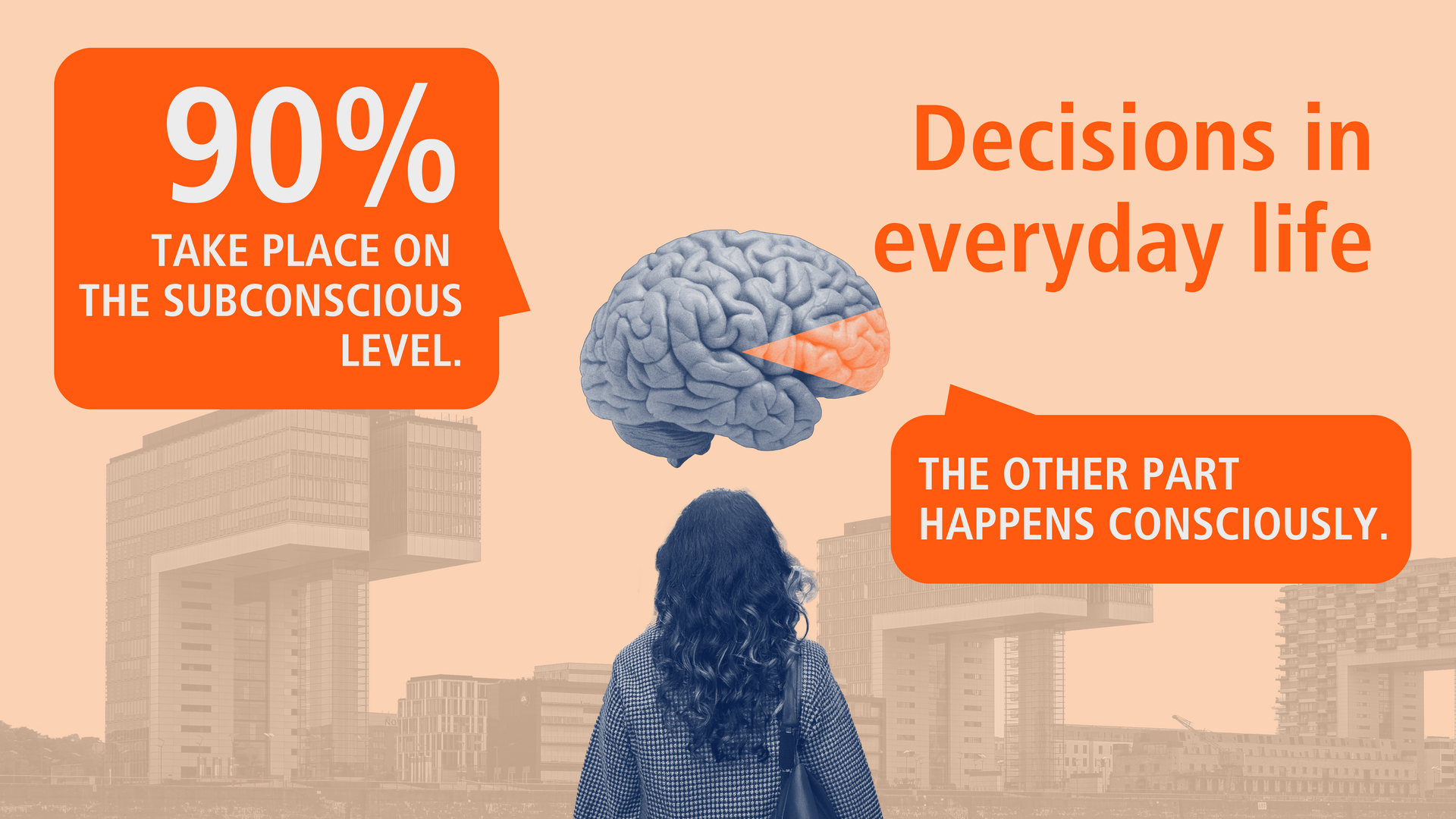
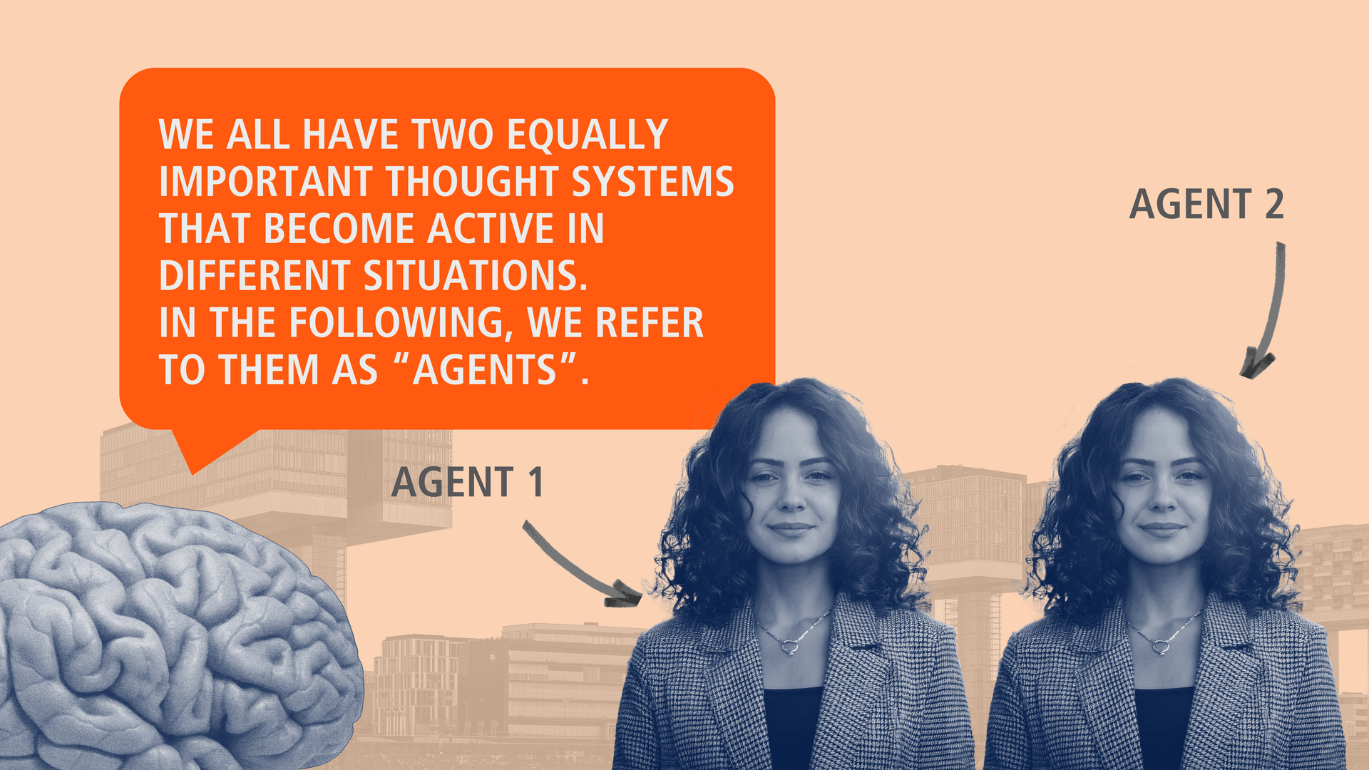
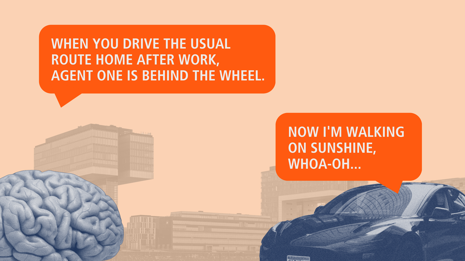
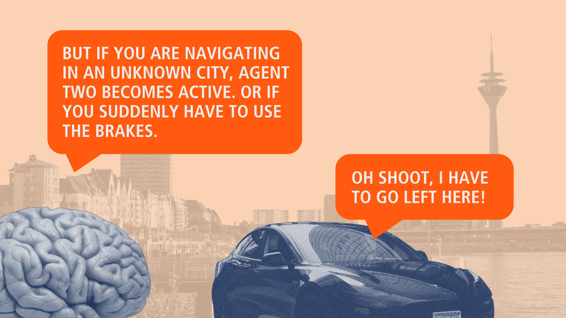
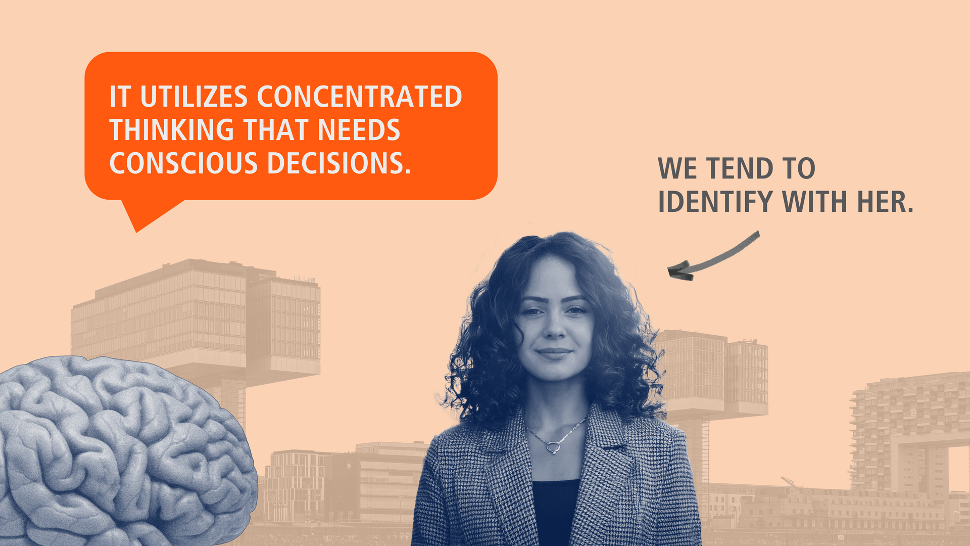
We humans. In our self-perception, we are rather complicated and cerebral beings – but in reality we are rather simple-minded. Fortunately, this is the only reason why we are fit for everyday life and don't spend time and energy on every decision. Our brain takes care of that. It makes more than 90% of decisions on its own, without asking us to make a conscious decision. Well-designed advertising has a corresponding effect on the subconscious, creating preferences and needs. More than 90% of the readers of these lines probably know this better and more thoroughly than the author of these lines.
So enough of the introductory words – or, to conclude, the fact that outdoor advertising, in its implicit perception, is a master at playing on the subconscious. And that means well-done outdoor advertising – which brings us to the topic of this article.
How do people perceive posters?
Public space is characterized by constant movement and visual stimuli. People rush to the train, wait at bus stops, stroll through shopping streets or get stuck in city traffic. In these situations, posters often only have a few seconds to be consciously or unconsciously noticed and convey their message. The trick is to stand out from the abundance of impressions and score points in the short time available – to be noticed.
Human perception follows very simple patterns. Our eyes and brains prefer clear structures and simple shapes. Images are easier to process than words. Visual stimuli are perceived more quickly if they stand out from their surroundings. Contrasts, colors and striking elements play a key role here. Colors evoke our emotions and associations, while contrasts ensure clear visibility. These principles form the basis for the design guidelines for good poster creation. Before we explain them briefly below, a message that is particularly close to the author's heart (paying tribute to the possibility that some readers may not read this article to the end). A brief plea for permission to break rules – to not comply to recommendations.
Creation: Breaking rules is a skill
Creativity thrives on experimentation and the courage to try new things. Developing a feeling for the right moment, when it makes sense to step outside the box, can be the key to success. It is often the unconventional approaches that have the greatest impact and are remembered for a long time. Who would have thought that a poster that seemingly breaks all the rules would ultimately be so convincing? Cleverly breaking the rules can also be a path to success. However, this is only possible if you know very well how to do it “basically right”. So here are some recommendations for effective poster design.
- Intelligible. A good poster should be understandable at first glance. Long, convoluted sentences and overloaded designs are out of place here. A poster is not a riddle magazine or a hidden object picture. A precise statement, succinctly put in a nutshell. Nothing more. On the poster, “less is more”. A renunciation that may hurt at first – but is then rewarded with success.
- Emotional. Images and symbols speak faster than words. A meaningful image can stir up emotions and lingers longer in the memory. A strong visual element attracts attention and anchors the message in the viewer's mind.
- Rich in contrast. Colors are important instruments in poster creation. They trigger our emotions and evoke associations. A high contrast between type and background ensures good legibility and emphasizes the central message. The choice of color should be in line with the brand identity and the intended tone of the message.
- Legible. Large, easy-to-read typefaces are an advantage. Serif fonts can look elegant, but are more difficult to read from a distance than sans serif fonts. Clarity and simplicity are also the top priorities here.
- Show yourself. Sender – brand logo. Already perfectly summed up in the editorial: it's best to make it so big that it hurts the art direction. And then bigger again.
- Format mix. Using different size formats in poster advertising is also helpful. The combination of different sizes ensures that the advertising message is perceived in a variety of ways and from different angles. More food for the brain – more connections.
- Analog plus digital. The use of motion graphics in digital outdoor advertising can significantly enhance the impact of printed posters. Digital displays enable dynamic content that attracts attention and can be flexibly adapted. In combination with printed posters, a diverse and even more effective campaign is created. While digital posters attract attention through movement effects and changing content, printed posters offer a constant presence and recognition.
Last but not least
Good poster advertising requires clear messages, strong visual stimuli, legible typography and a clear message. And it requires the willingness of product and marketing managers and creatives to focus on the core. The use of different size formats and a mix of digital and classic posters increase the impact and automatically bring variety to the campaign. And sometimes – but only sometimes – it is worth consciously throwing familiar rules overboard and taking a new approach. With this in mind: we are all happy every day when we see good posters. Posters are art in public space.
And already inspired for the next D(OOH) campaign? In the coming months, our multi-part blog series will present the most important elements of (D)OOH creation, show various possibilities for interaction and inspire you with innovative and technology-linked examples of success. Stay tuned!
Media content in this blog post was created with the help of AI.


