02. October 2024
Creative design for public video: How DOOH spots become eye-catchers
- Public Video
- DOOH
- Digital DOOH
In our daily lives, we encounter outdoor advertising in different ways and in different forms: Whether large, imposing, digital or analog. But how do you manage to attract the full attention of the target group with an average viewing time of two seconds and convey a message that will be remembered? This entails special rules and design tips.
After delving into the world of poster advertising in the last article, this week we are going digital. How do the design rules change when DOOH suddenly brings movement to outdoor advertising? Our author Hannah Peter answers all these questions in the following article.
The answer lies in the art of design. In our last article, we highlighted the design principles for successful poster advertising: clear messages, strong visual stimuli, legible typography and a clearly recognizable sender. These guidelines also apply to today's topic, the Digital-Out-of-Home (DOOH) genre.
DOOH – for us, that means public video. And public video, as the name suggests, is moving images in public spaces. Moving images are emotional, captivate the eye and offer many possibilities for motif design. Almost endless creative possibilities -– but unfortunately this also means a lot of room for unsuccessful creations.
In this article, we therefore present various tips and principles for standing out from the crowd and staying in people's minds.
Understanding the target group: the situation is crucial
Public video reaches people in a wide variety of situations: from lingering on the platform to walking briskly past in a station arcade. For the creation, it is crucial to put yourself in the viewers' shoes and adapt the spot accordingly.
The waiting situation
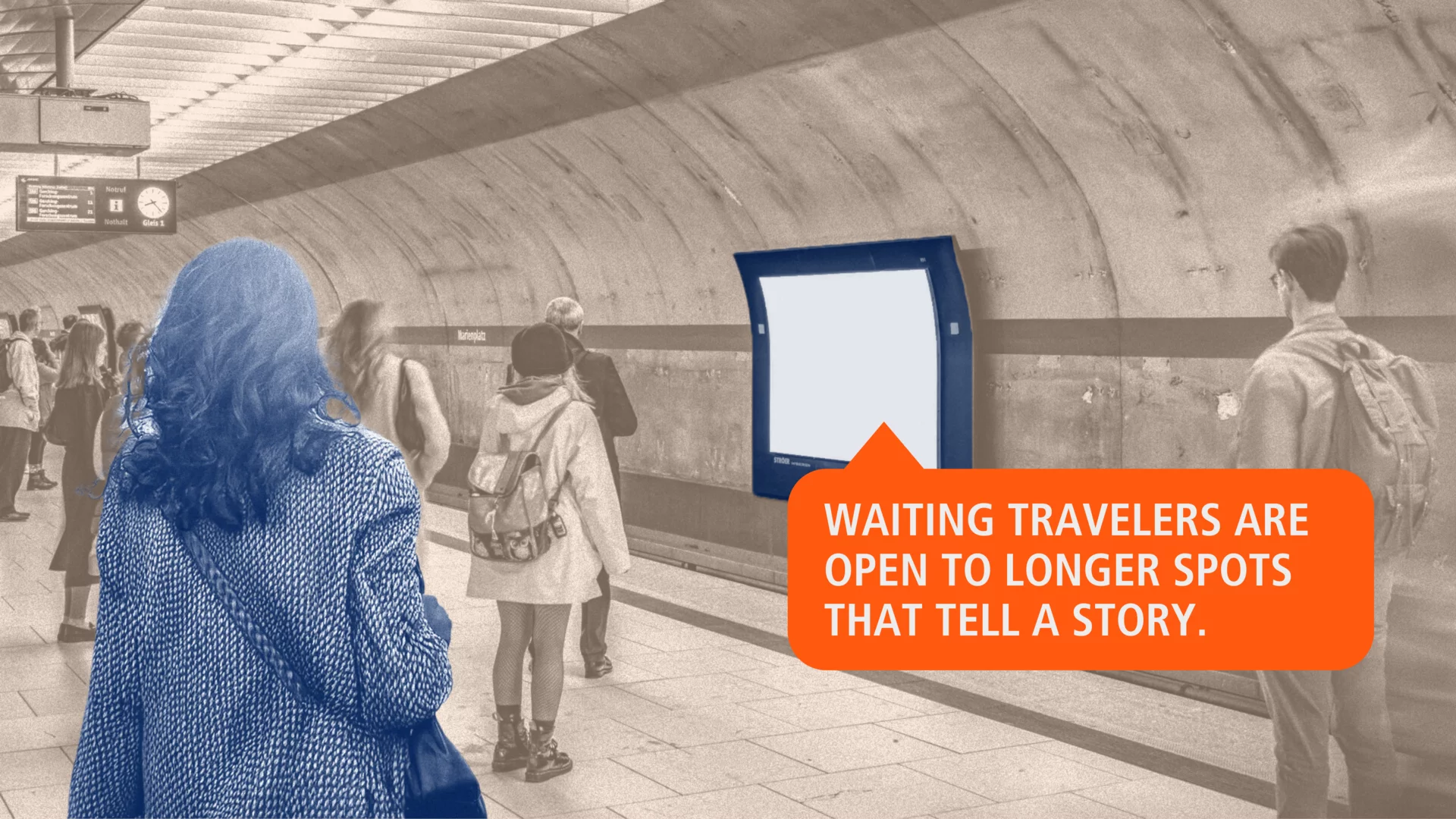
While waiting and lingering on the platform, variety is required! Information, entertainment or an exciting advertising message – in waiting situations, people are open to stories. The linear perception situation allows for a wide range in the creation and dramaturgy of commercials.
Advertising shown in the waiting situation can sometimes be a little longer than the usual 10 seconds. After all, people waiting for the train at the station may well do so for several minutes, have time to read through something, puzzle over it, understand a pun or grasp other more complex messages. The waiting situation can also be used to play longer commercials that tell a story.
The passenger situation
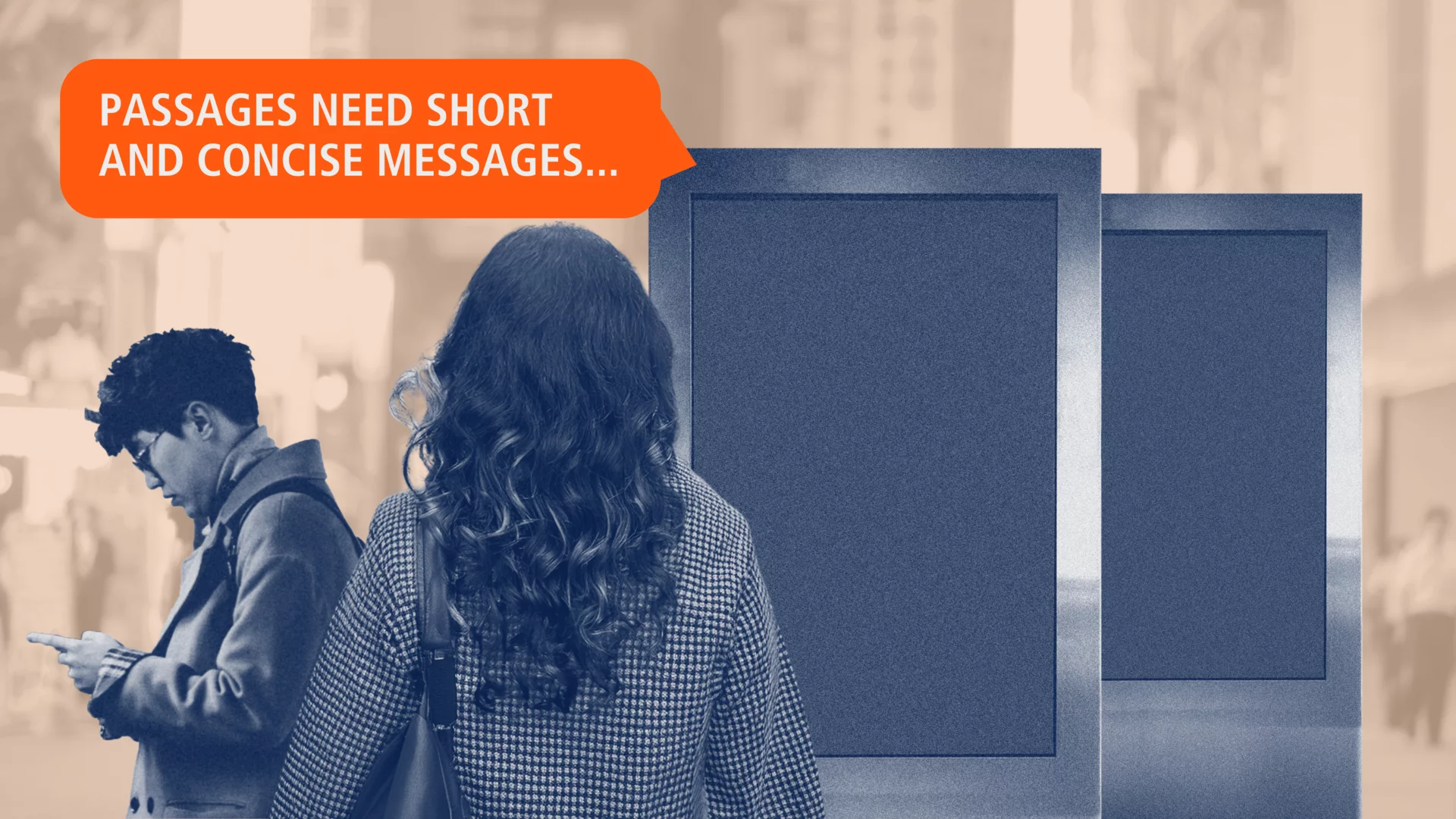
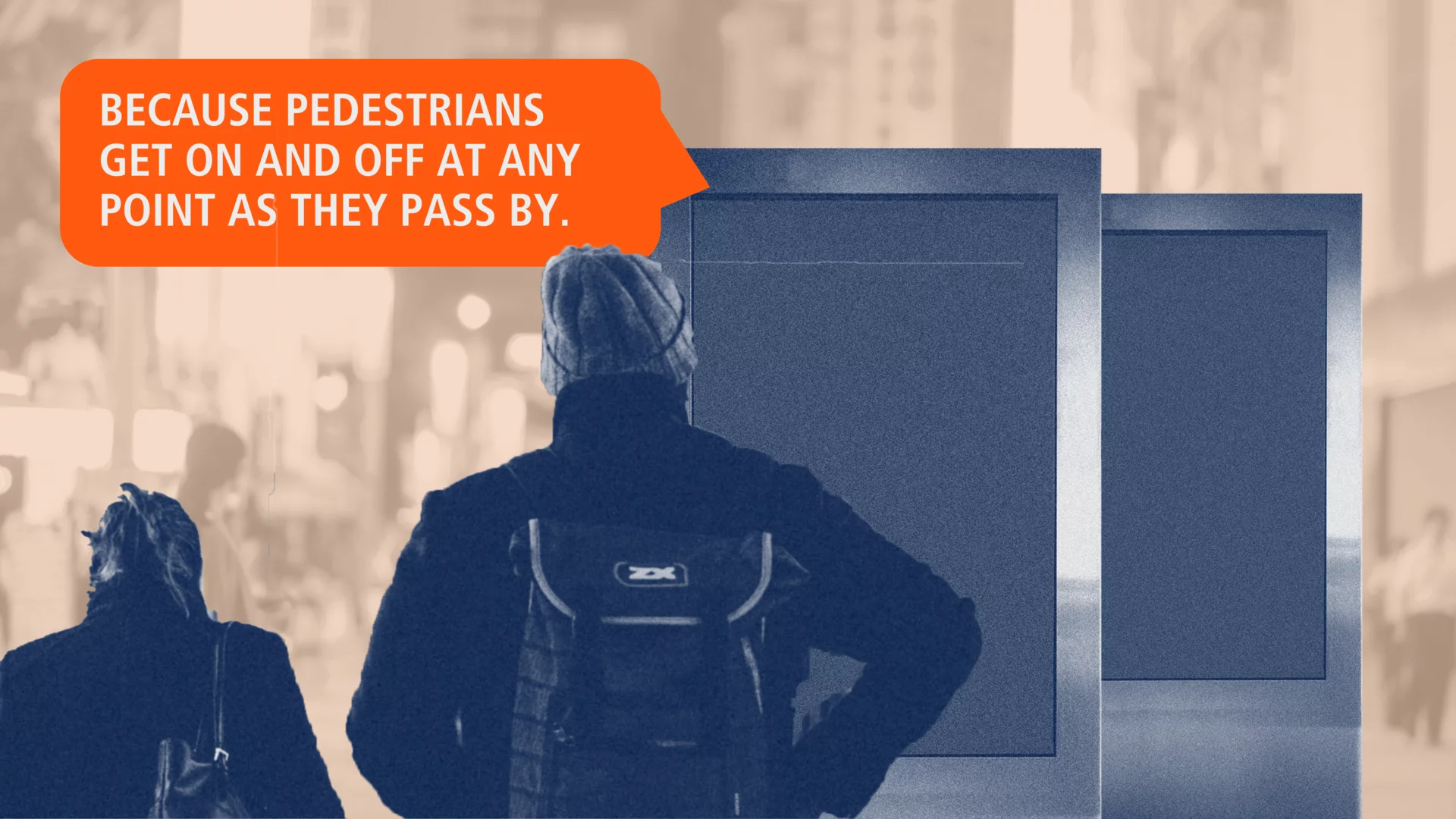
Many of the public video screens are also located in busy shopping malls or train station passages. As a result, pedestrians often enter and exit the spot at a random point.
Don't worry, these are usually not individual screens, but several advertising media are usually placed one behind the other, so that multiple synchronized screens show the same commercial within one line of sight. Nevertheless, the commercials should work with short, concise messages and memorable images, especially in passenger situations. In addition, the relevant key messages must be visible in every perceptible section.
Creation: design principles for DOOH
- Focus on simplicity. Basically, less is more. The message must be easy to understand and decode. Visual stimuli through animations and moving images help to stimulate the eye, but overload should be avoided. Visuals, images and image-like elements as well as individual signal words may change somewhat more quickly – however, texts that contain the core message should remain longer or, if possible, even be visible throughout the entire spot.
- Visibility of the sender and product. A clearly recognizable sender in the form of a large and prominent logo is important. We already learned this in the last blog post on “Design rules for posters”. As public video commercials are often seen in sequences and viewers enter and exit at any point, it is also important for moving image commercials that the (large and concise) sender – i.e. the brand – remains visible throughout. In addition to the brand, the advertised product or service should also be permanently visible. The larger and more eye-catching the product is presented in the commercial, the more likely it is to attract the attention of the target group.
- Concise communication. The perception of people takes place in a series of reality windows, each of which covers a period of 3 to 5 seconds. It is best to divide the commercial into several sequences according to these sensory units. It is then important to set the right focus for each sequence – ideally one key message per sequence!
- Strong colors and contrasts. Colors and contrasts are important tools for attracting and holding the viewer's attention. However, high-contrast and vibrant color codes should be used deliberately and carefully to achieve the desired effect. Too much change or too many bright colors can be overwhelming and distract from the essentials. Subtle color changes and gentle contrasts within the spotlight, on the other hand, create the necessary tension without overstimulating the eye. Incidentally, a high proportion of black in the image reduces the energy consumption of the screen and is therefore more environmentally friendly.
- Evoke emotions. Moving images are particularly effective at triggering emotions and this ability should be used to create a deeper connection with the target audience. The image itself carries the main message, while supporting words underline it. A high proportion of images and image-like elements enhances the emotional impact and ensures that the message is not only understood, but also felt. The text content should be reduced to the essentials so that the message is conveyed clearly and without distraction.
- Individual approach to target groups. A major advantage of DOOH is its flexibility. Spots can be individually tailored to times of day, locations or specific target groups as part of dynamic creative. A suitable and personalized approach to the target group at the right time and in the right place increases relevance and strengthens trust.
- Playing with the format. Whether using 3D motifs or “playing with the screen” – a recurring and yet very effective element in DOOH creations is the playful “staging” of the advertising medium: the screen's glass appears to break, people or elements seem to move around inside the advertising medium, synchronized screens show coordinated motifs – a kind of “domino effect”. By understanding the advertising medium and adapting the commercials precisely to the format, positioning, environment and nature of the advertising medium, an unmistakable and fascinating creation is created.
Excursus 1
The right use of motion: From cinemagrams to moving images
A particular challenge with DOOH is selecting the right motion elements. In some cities, only certain types of movement are permitted on public video outdoor screens due to their positioning on the street. A distinction is made here between:
- Still images: No movement. Allowed everywhere.
- Cinemagrams: Subtle, slow movements only in small image areas.
- Animations: Full-surface animation and soft overlays of text and image elements.
- Moving images: Full freedom of movement.
Excursus 2
Minimum font size on Public Video Outdoor
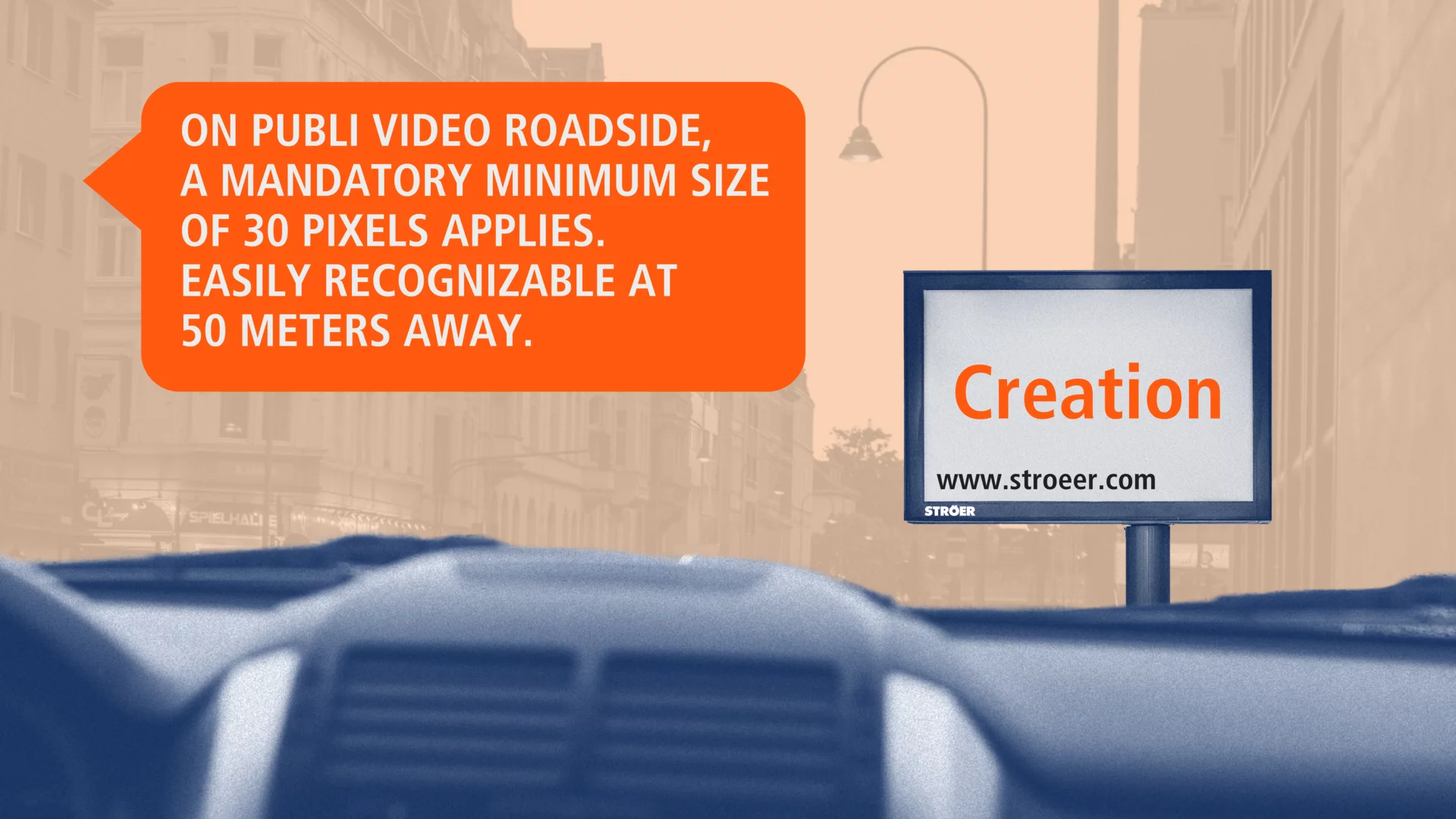
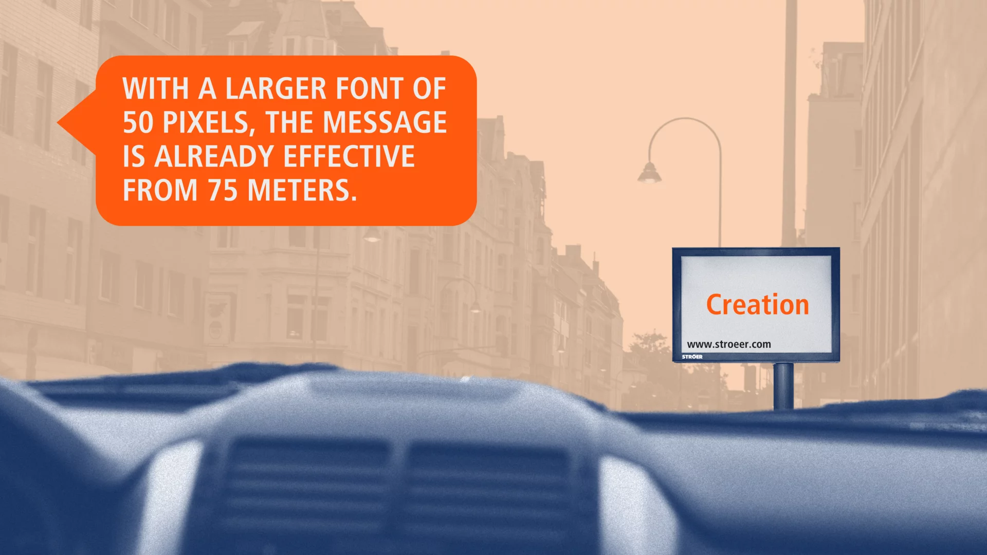
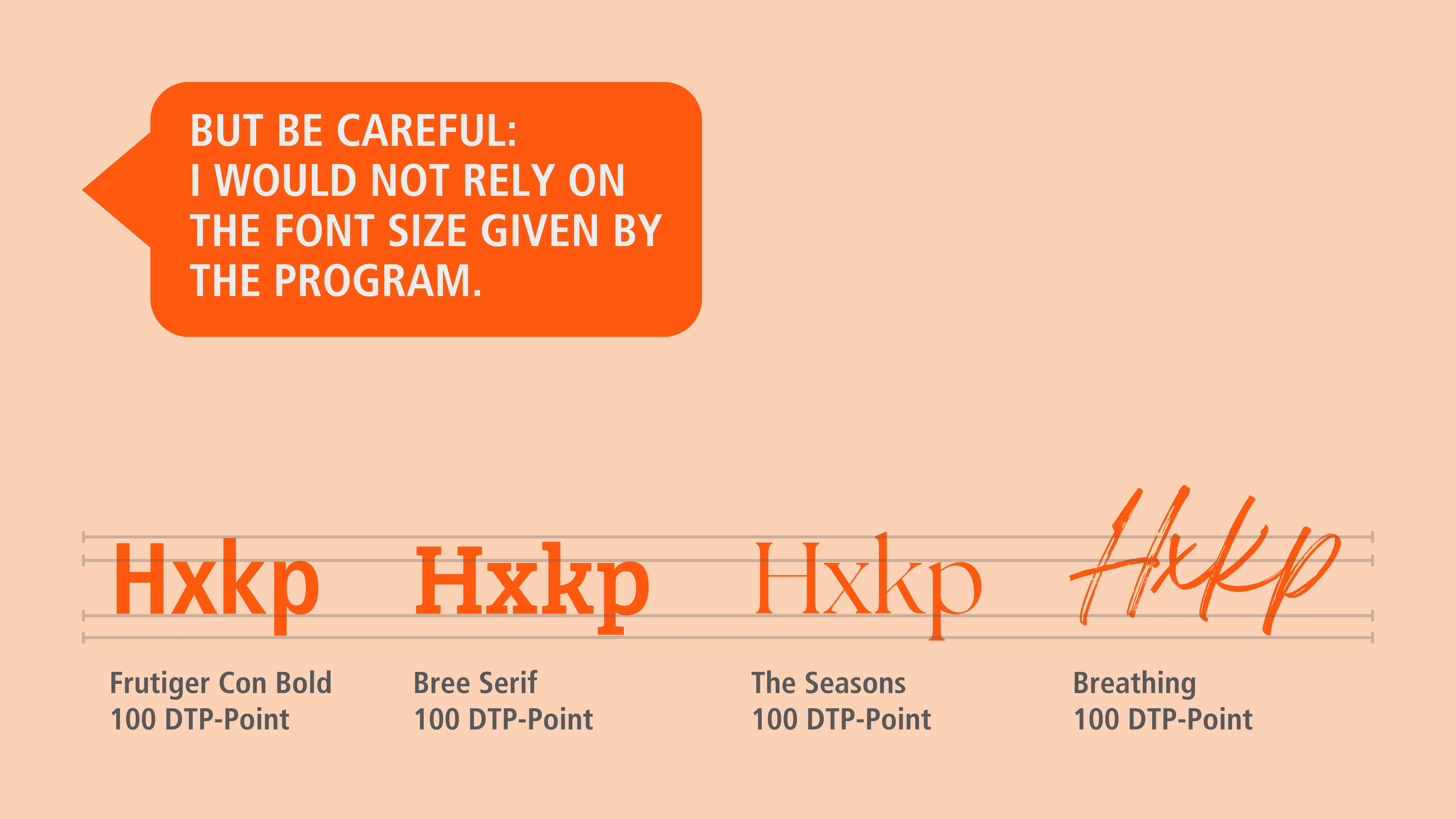
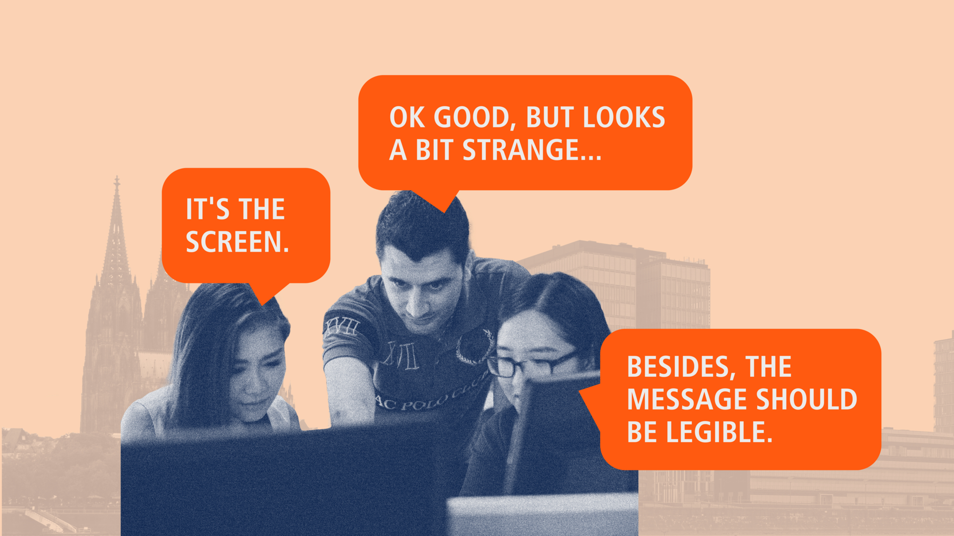
Another requirement in the outdoor sector is the minimum font size for motifs. A larger font size leads to a better long-distance effect and accordingly to passers-by and drivers being able to decipher the content from a distance of up to 75 meters. Even if the motif then appears disproportionate on the laptop screen, the minimum font size ensures that the content is legible.
Conclusion: the courage to be creative
A good DOOH motif impresses with clarity, visual power, emotional appeal and targeted, relevant messages. The use of dynamic content and movement effectively captures the viewer's attention. The challenge is to use the complex possibilities of the medium skillfully and at the same time put yourself in the perspective of the target group.
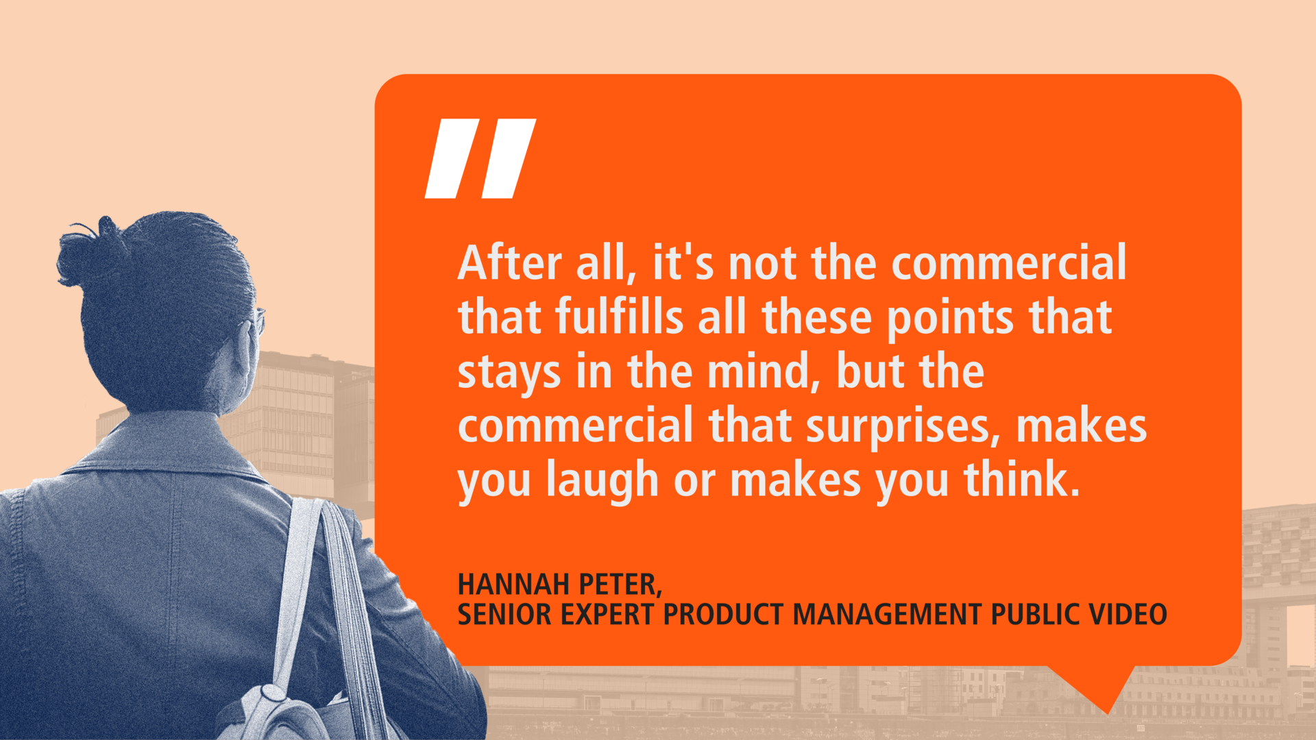
Even if the recommendations described form a basic set of rules for DOOH creations, in the end it comes down to being creative and standing out from the rest. After all, it's not the ad that fulfills all these points that stays in people's minds, but the spot that surprises them, makes them laugh or makes them think.
And already inspired for the next D(OOH) campaign? In the coming months, our multi-part blog series will present the most important elements of (D)OOH creation, show various possibilities for interaction and inspire with innovative and technology-linked examples of success. Stay tuned!
Media content in this blog post was created with the help of AI.
